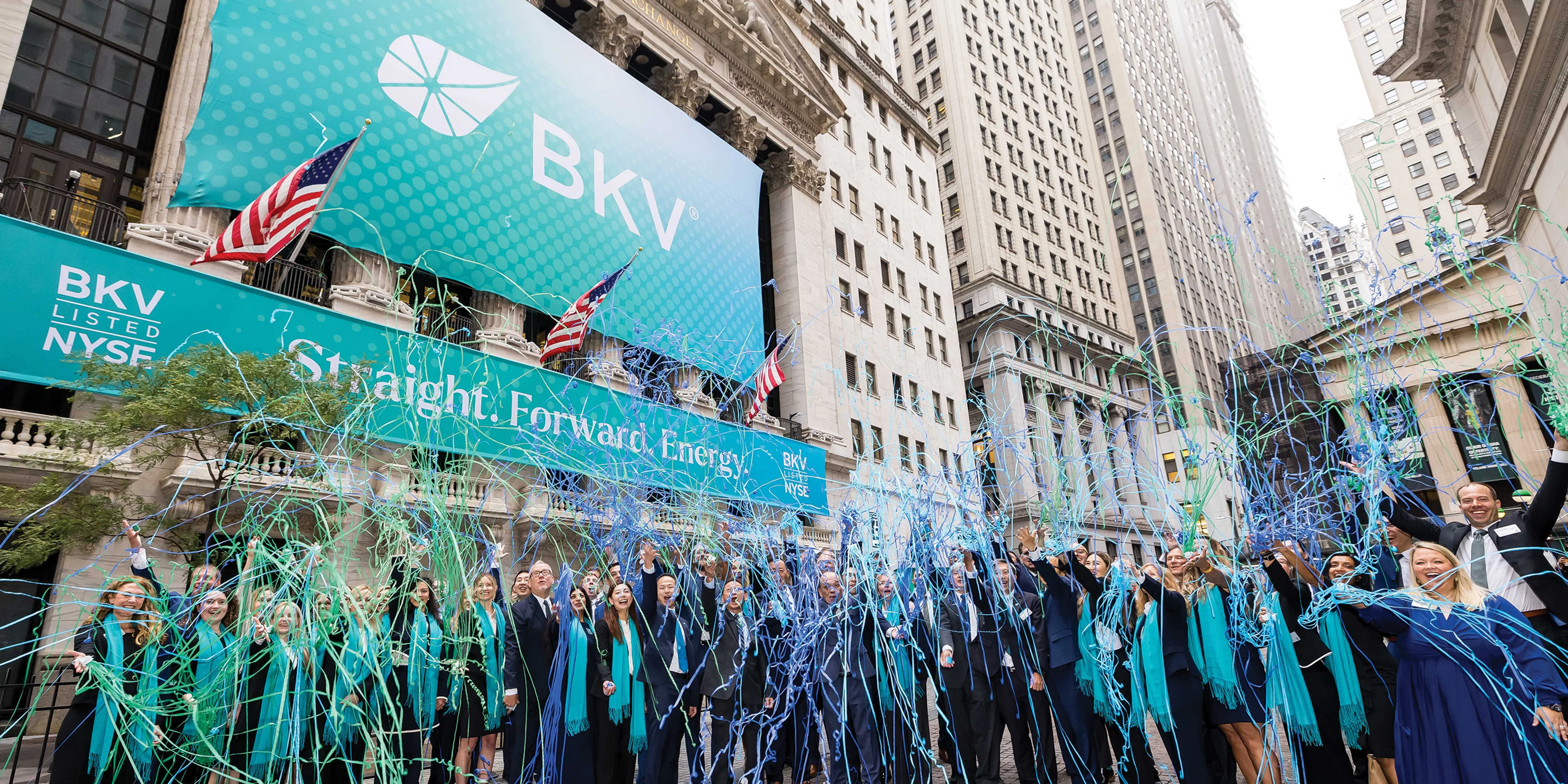
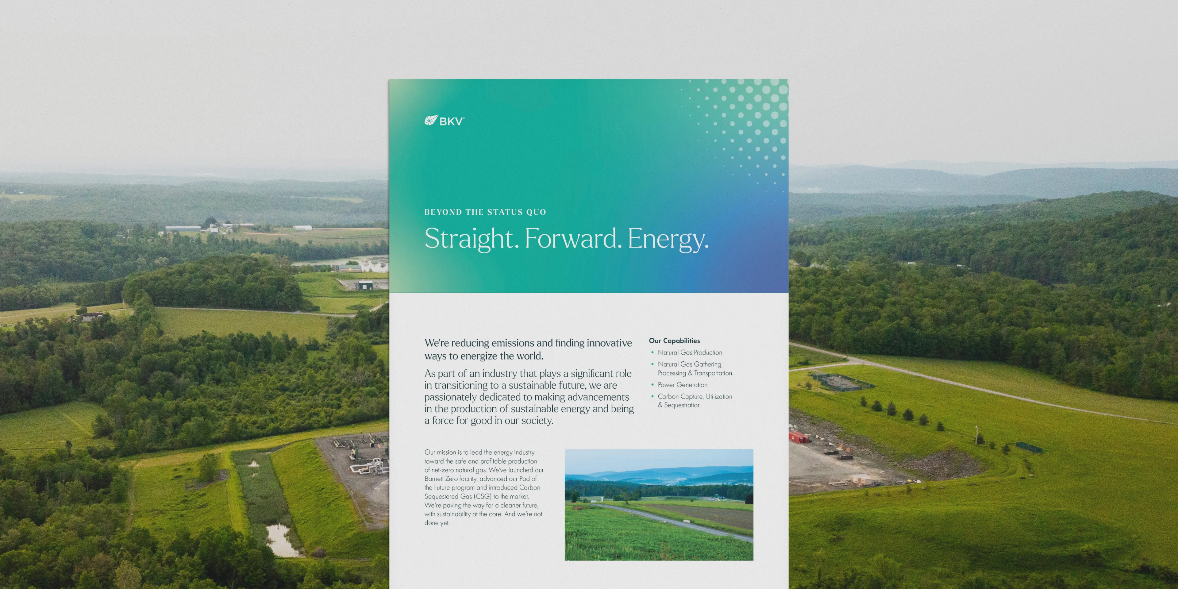
BKV Brand Guidelines
Designing for Growth, Built for Clarity.
Our brand is evolving to reflect BKV’s bold vision for the future of energy. We have updated our identity to highlight the grit, innovation and progress that define us. This refresh refines our visual language for clarity and consistency, providing a dynamic toolkit to communicate our story as we move forward.
Our Visual Identity
These are the core elements that make our design system.
The BKV Mark
The most identifiable part of our brand is our logo. Its consistent use is crucial for maintaining our brand's strength and immediate recognition. Our logo is a unique and proprietary element that represents who we are and what we stand for as a brand.
Different combinations and formats can be used depending on the context.
Logo Orientation
Color Variation
These files have been provided in ai, eps, pdf, jpg and png file formats.
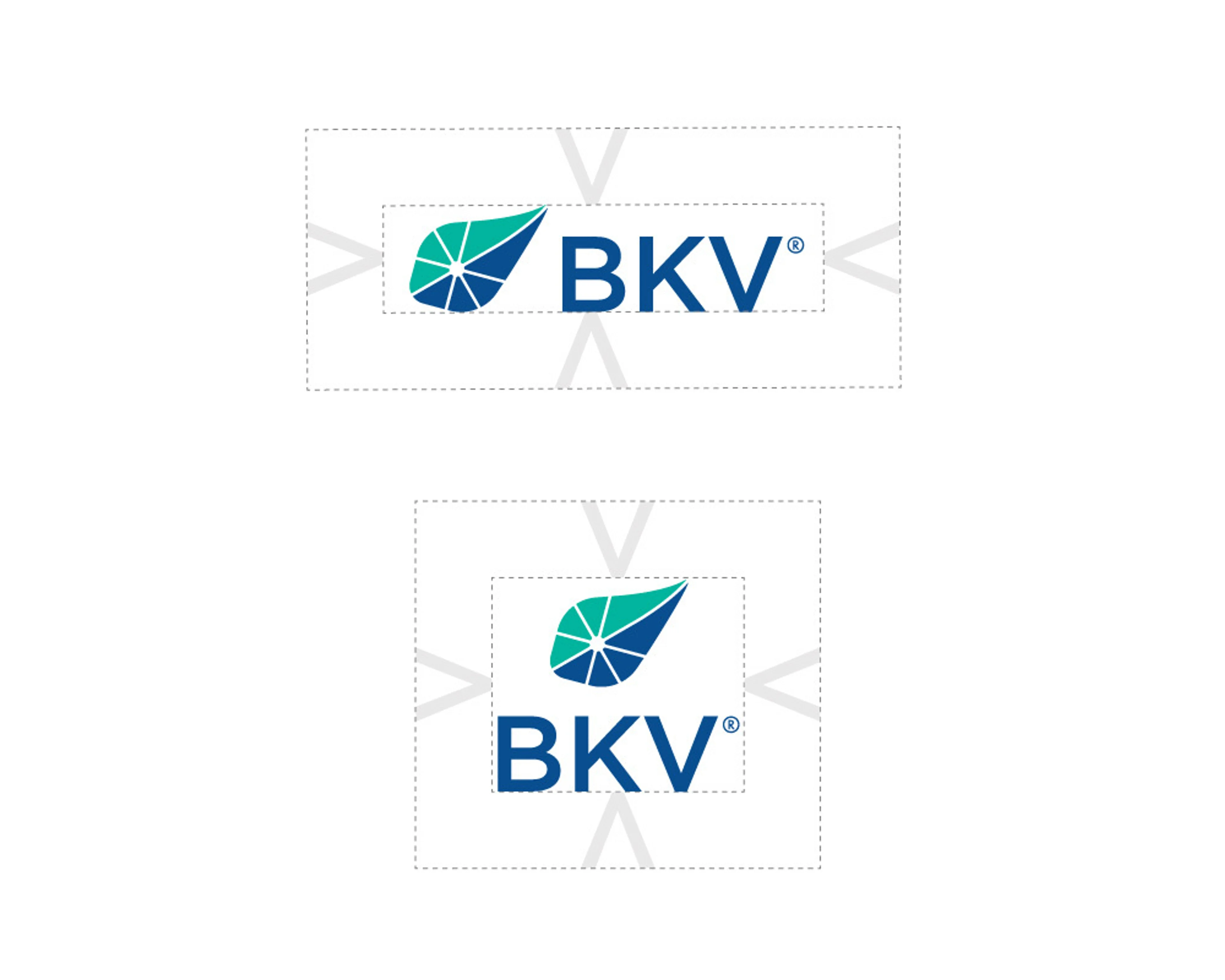
Area of Isolation
To ensure that the logo is clear and readable, there should be a clear space between the logo and other competing design elements.
Use the height of the “V” in “BKV” to measure the distance between the logo and other content
Minimum Size
Our logo is designed to scale to small sizes on print and screen. The horizontal version can scale down to 0.75 inch (2 centimeters) or 54 pixels. The vertical version can scale down to 0.5 inch (1.27 centimeters) or 36 pixels.
There will be times when the available surface will be too small to print the logo at these sizes. Reproducing a logo on small promotional items is often challenging. In such cases, make the logo as big as space allows.

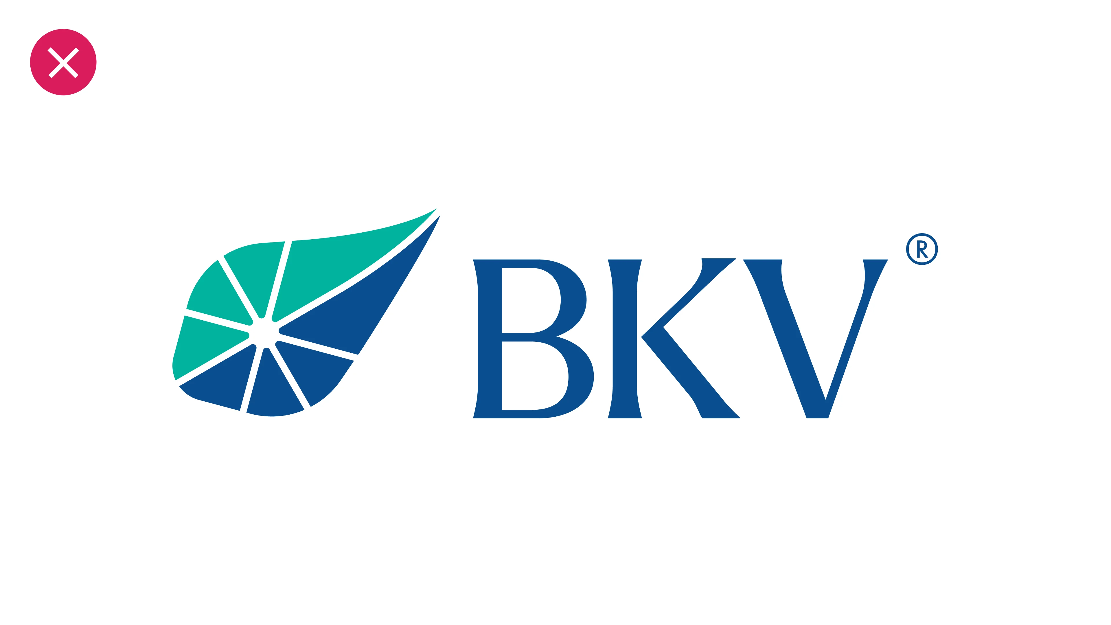
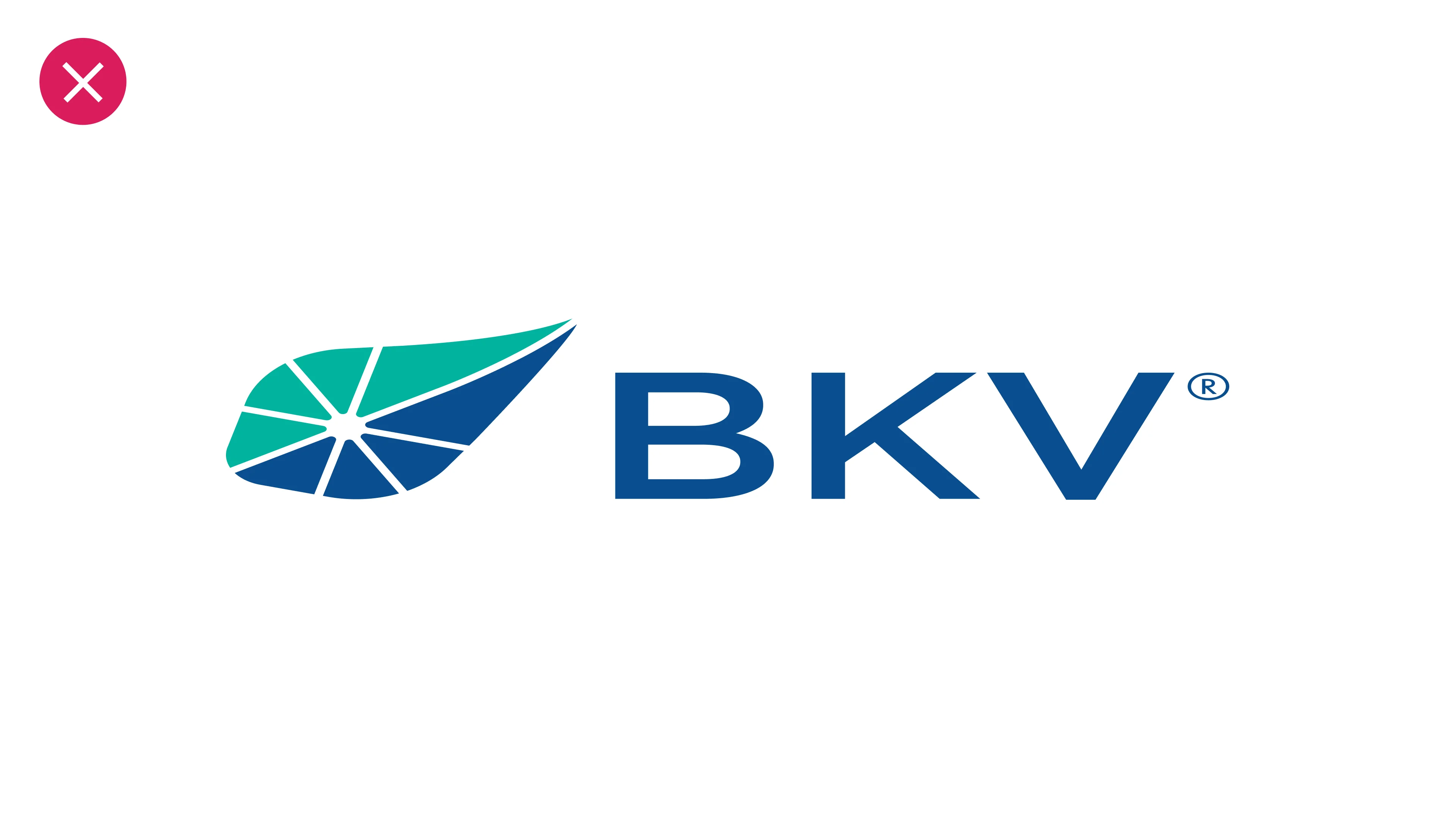
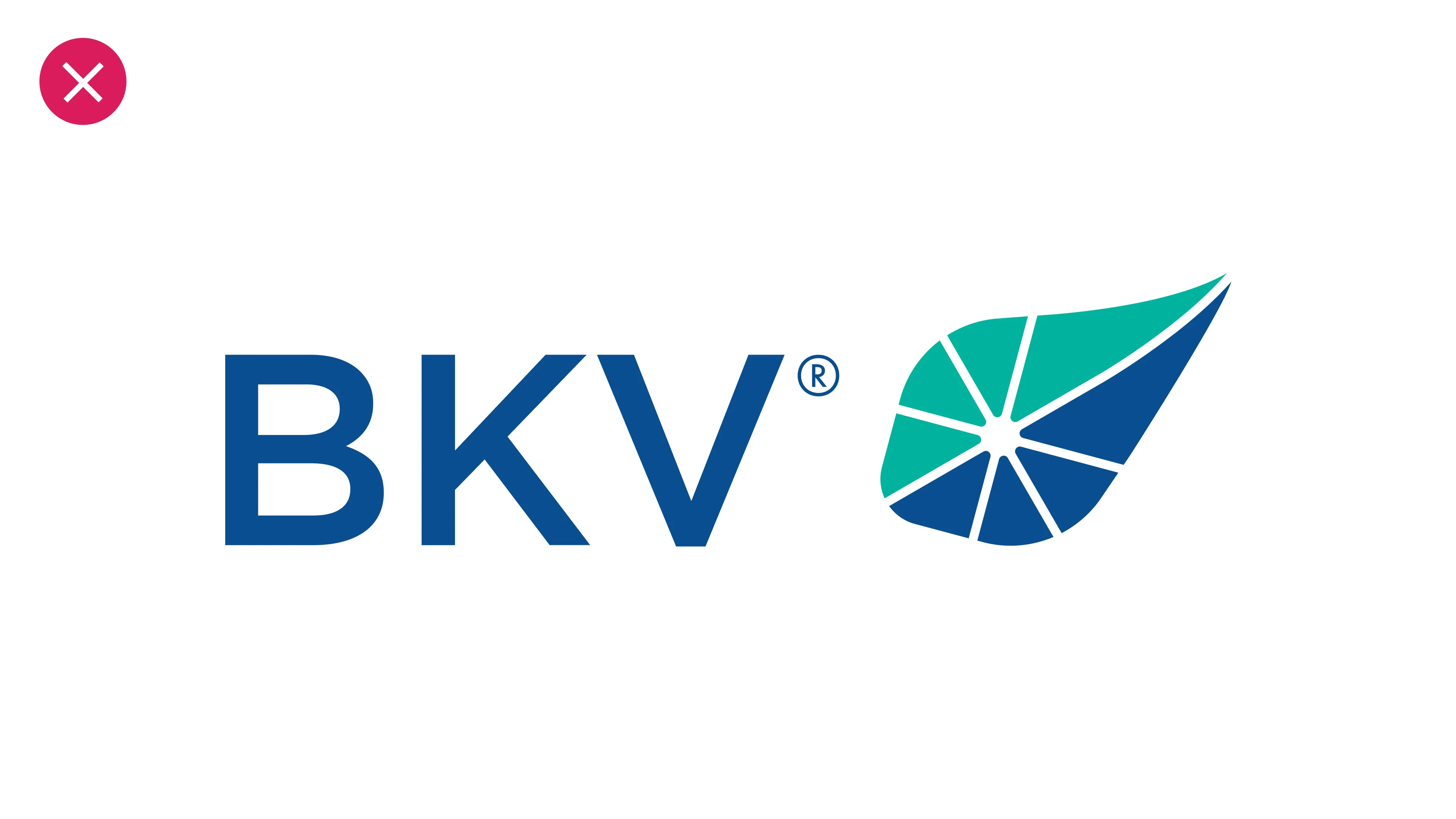
Improper Logo Usage
To protect our brand strength, the logo should only be used in its approved formats. Do not alter its typeface, orientation, proportions or colors, and avoid adding effects.
The examples shown here illustrate common misuses to avoid.
Do not replace the logotype with another typeface.
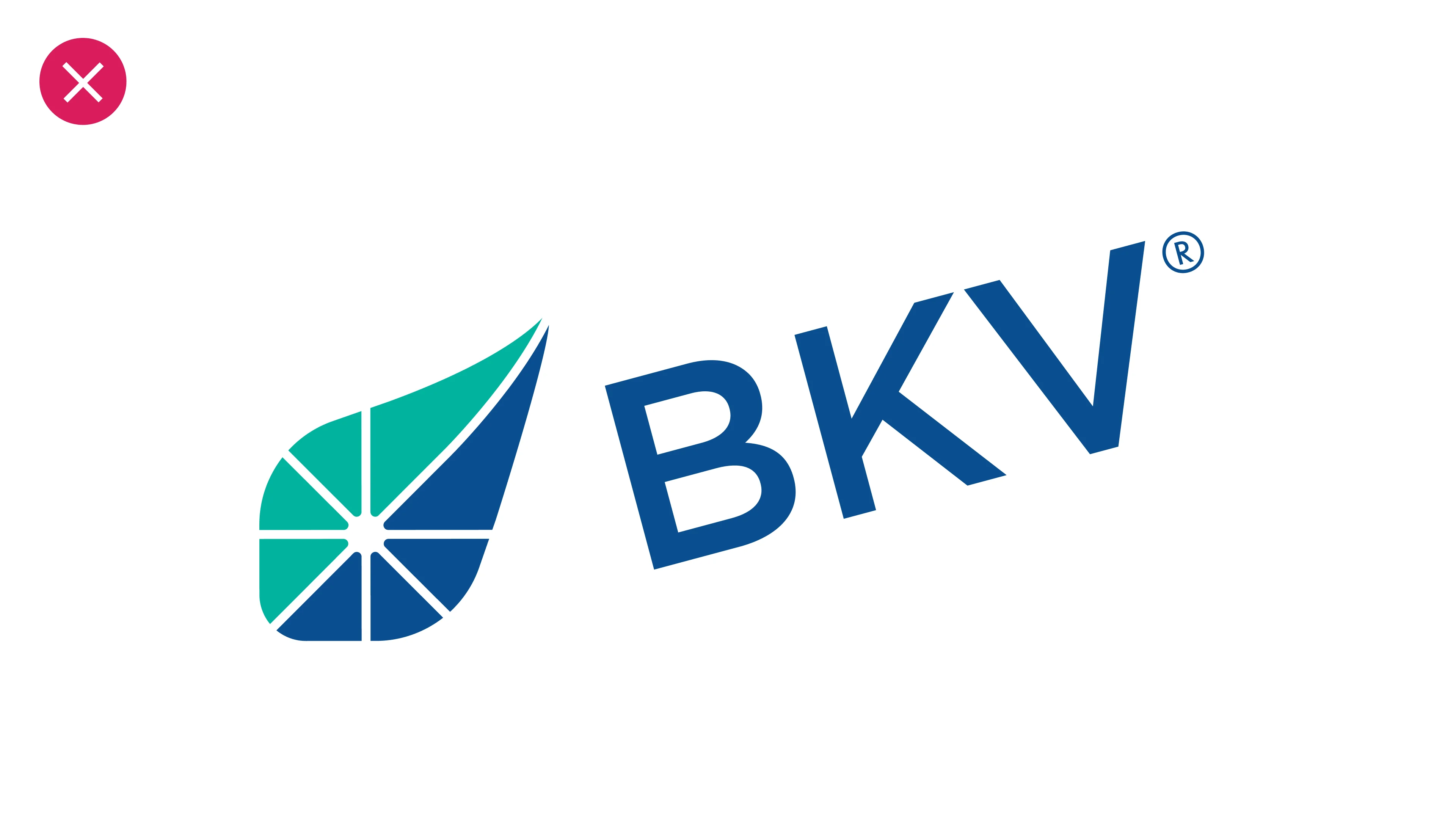
Do not rotate the symbol and/or the logotype to an alternate angle.
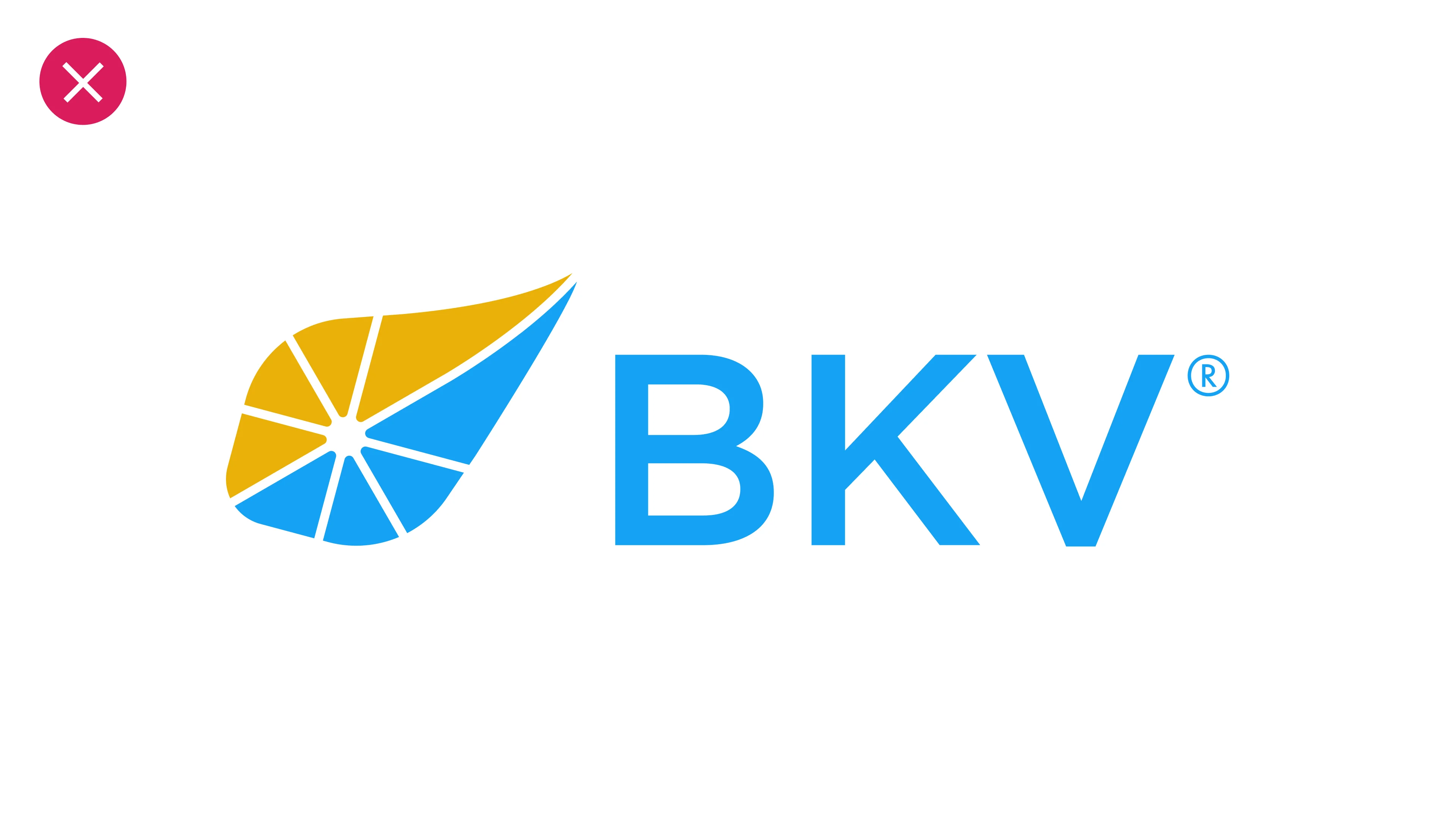
Do not change the colors of the logo.
Do not stretch, condense or distort the logo in any way.
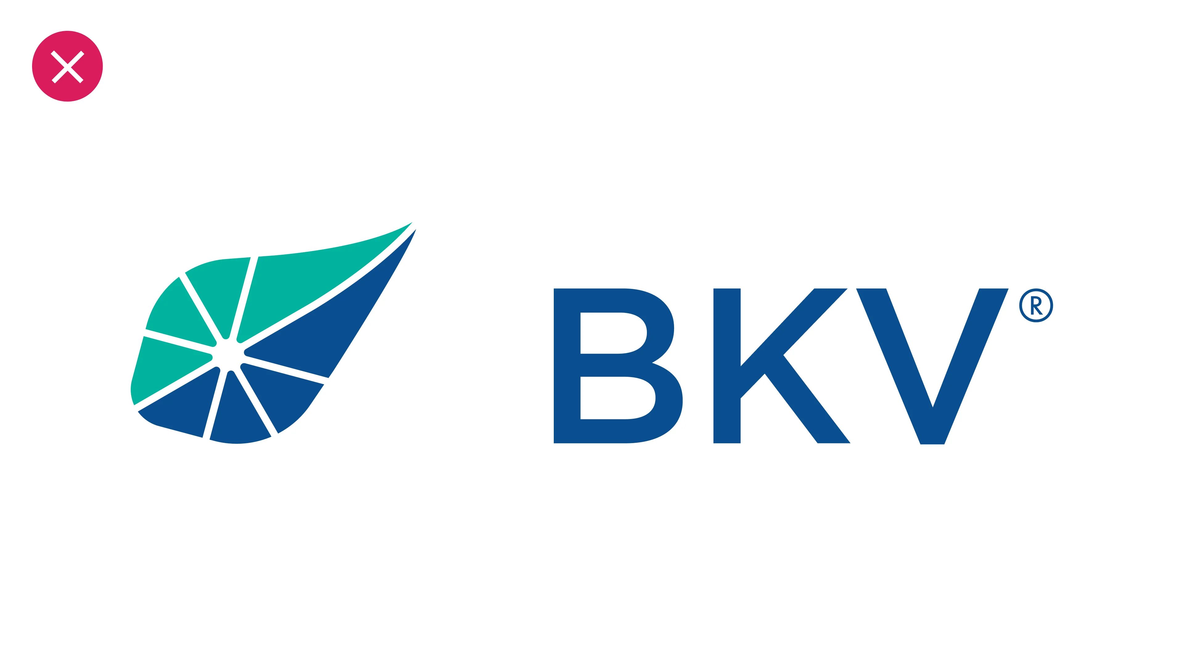
Do not alter distance between the symbol and the logotype.
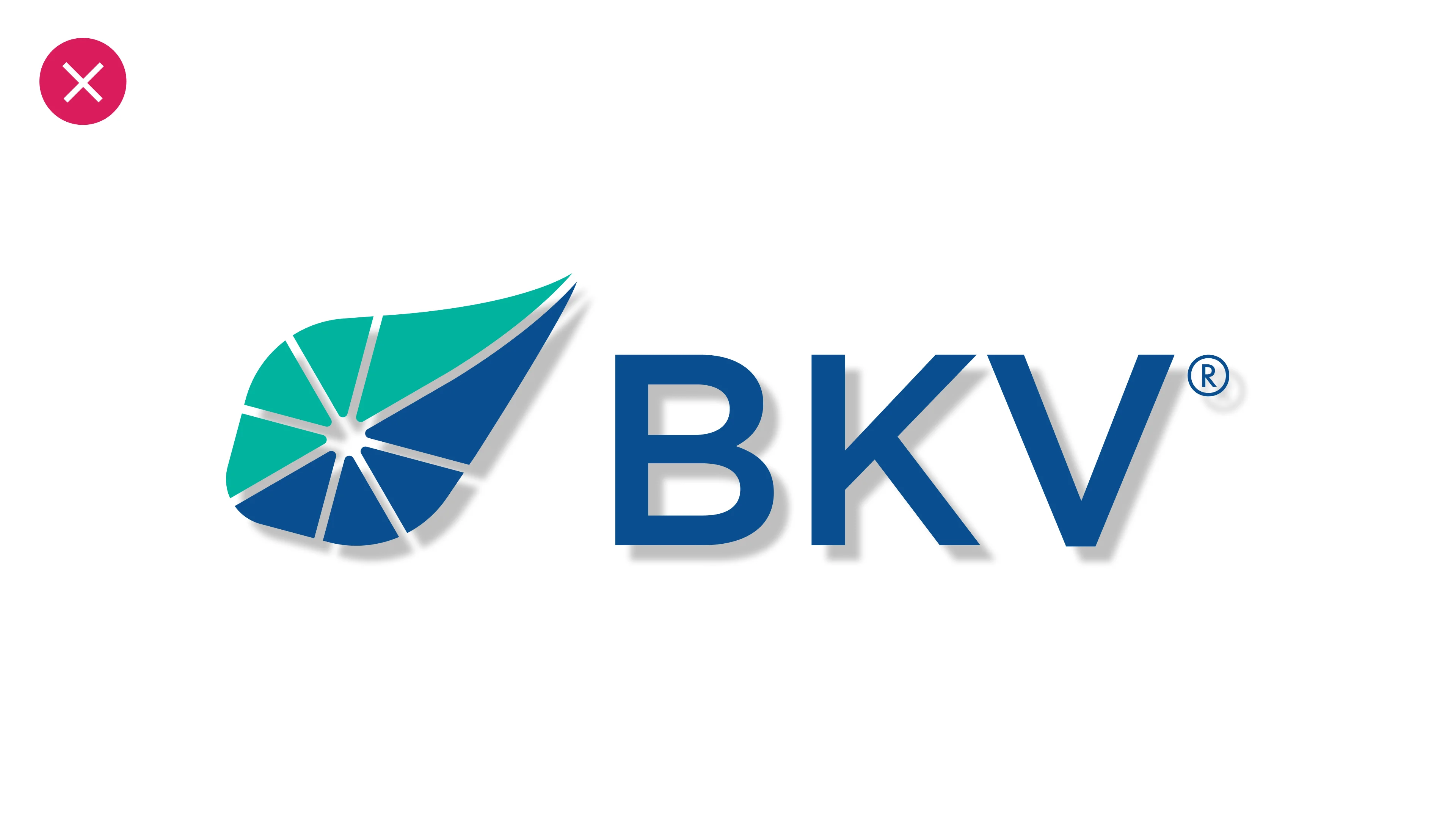
Do not add drop shadows or other effects to the logo
Do not alter the orientation of the symbol and logotype.
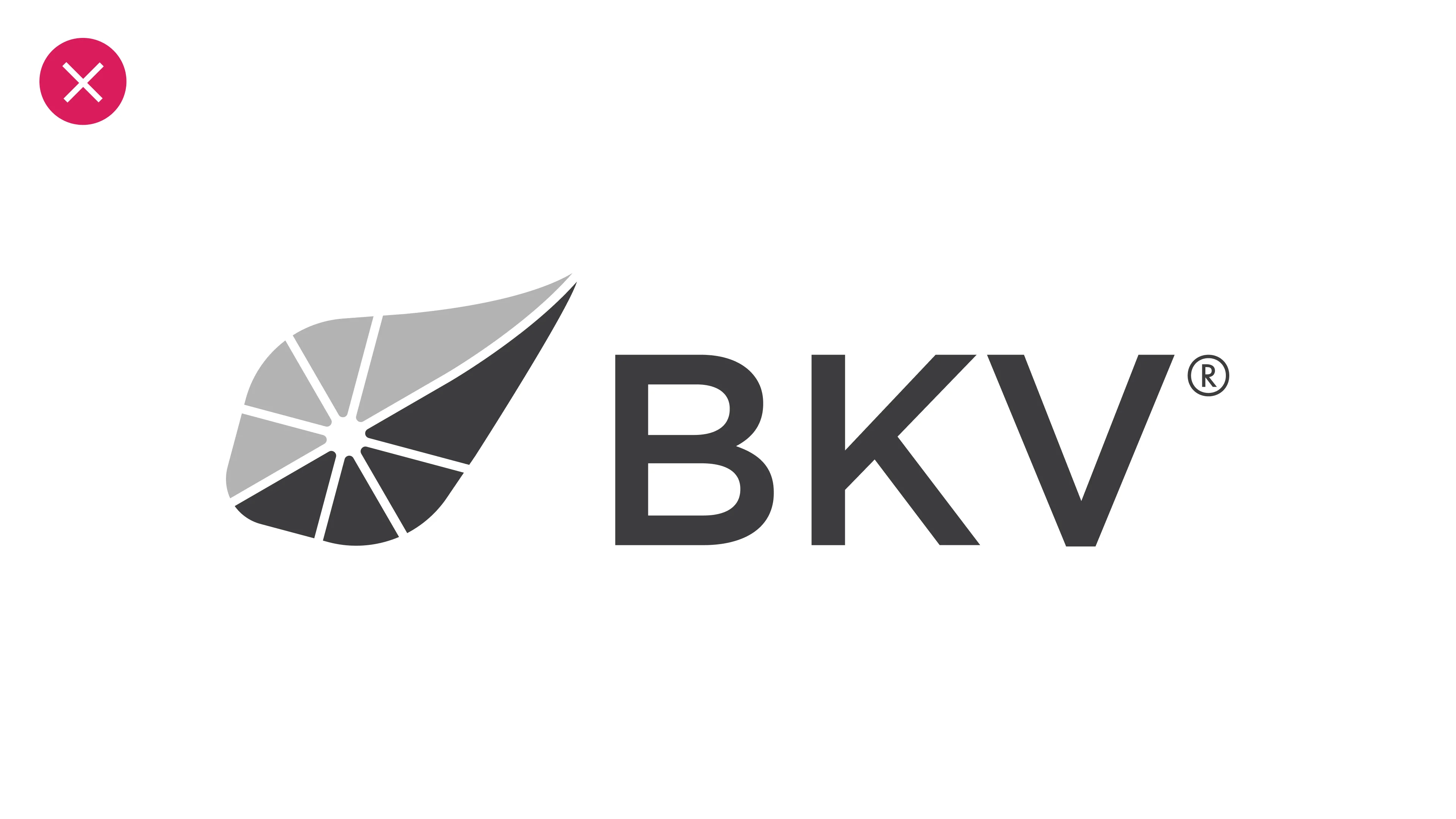
Do not change the colors of the logo to gray scale.

The First Impression
Color is the first element audiences notice in a brand’s identity. It conveys emotion before language, sets expectations before interaction and creates recognition before recall.
A considered palette does more than differentiate; it defines.
One True Blue
We have evolved the use of blue to reflect our brand’s new identity. We now reserve BKV Blue for the logo only, treating it as a proprietary and unique color that should not be repeated elsewhere.
This shift both honors the color’s legacy and opens the door to a more expansive palette that reflects our innovative, future-facing identity
Use
White
Space
White is a foundational color in our palette and an essential element of our visual identity. It's not just an absence of color; it's the space that allows other elements to breathe. Using white generously ensures a clean, confident and modern look for all of our communications.
Primary Colors
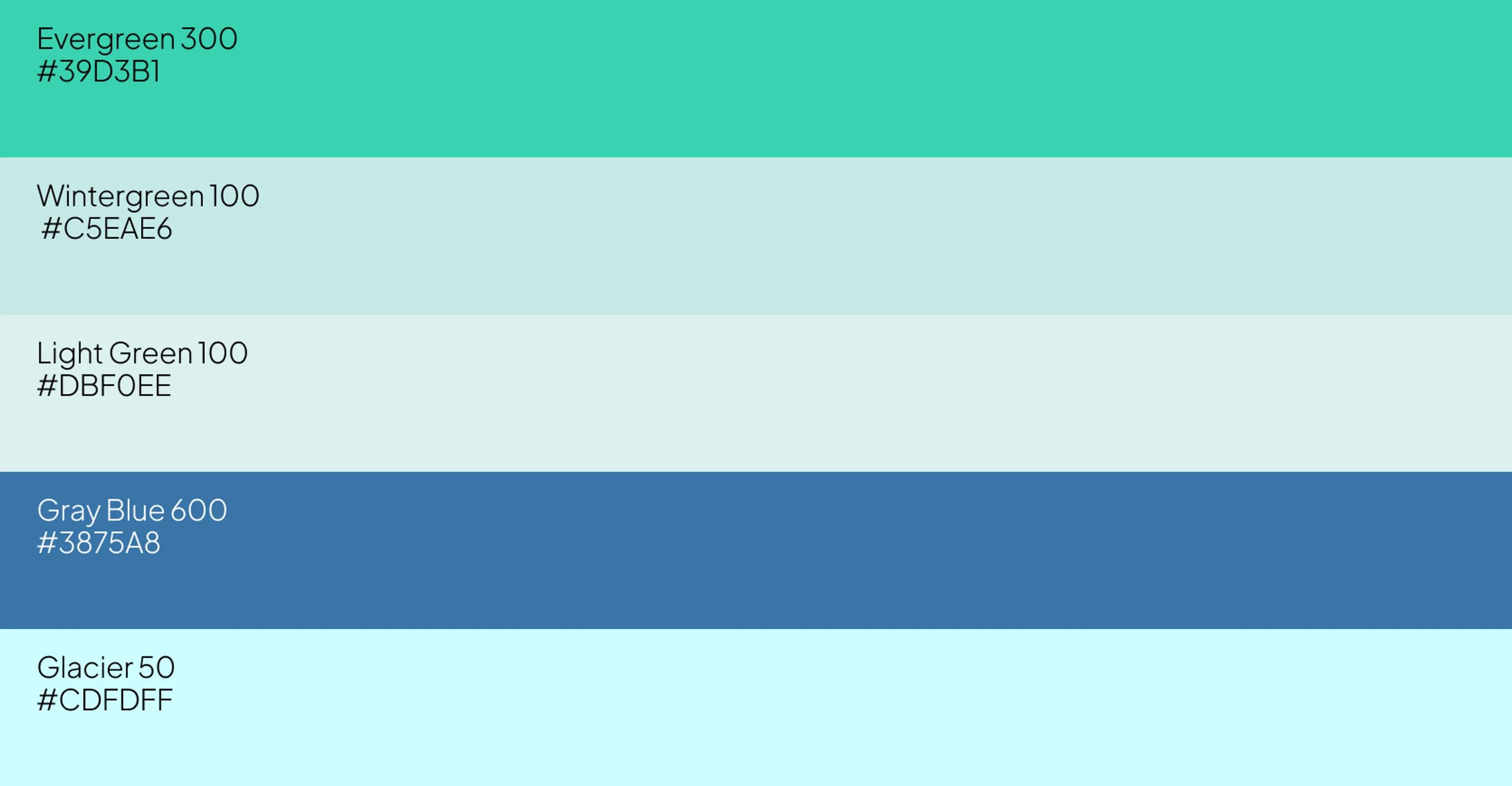
Our primary brand colors are the core of our visual identity. This expanded palette reflects BKV's evolving, multi-dimensional and future-facing identity. These colors should be the dominant tones in all of our visual communications.
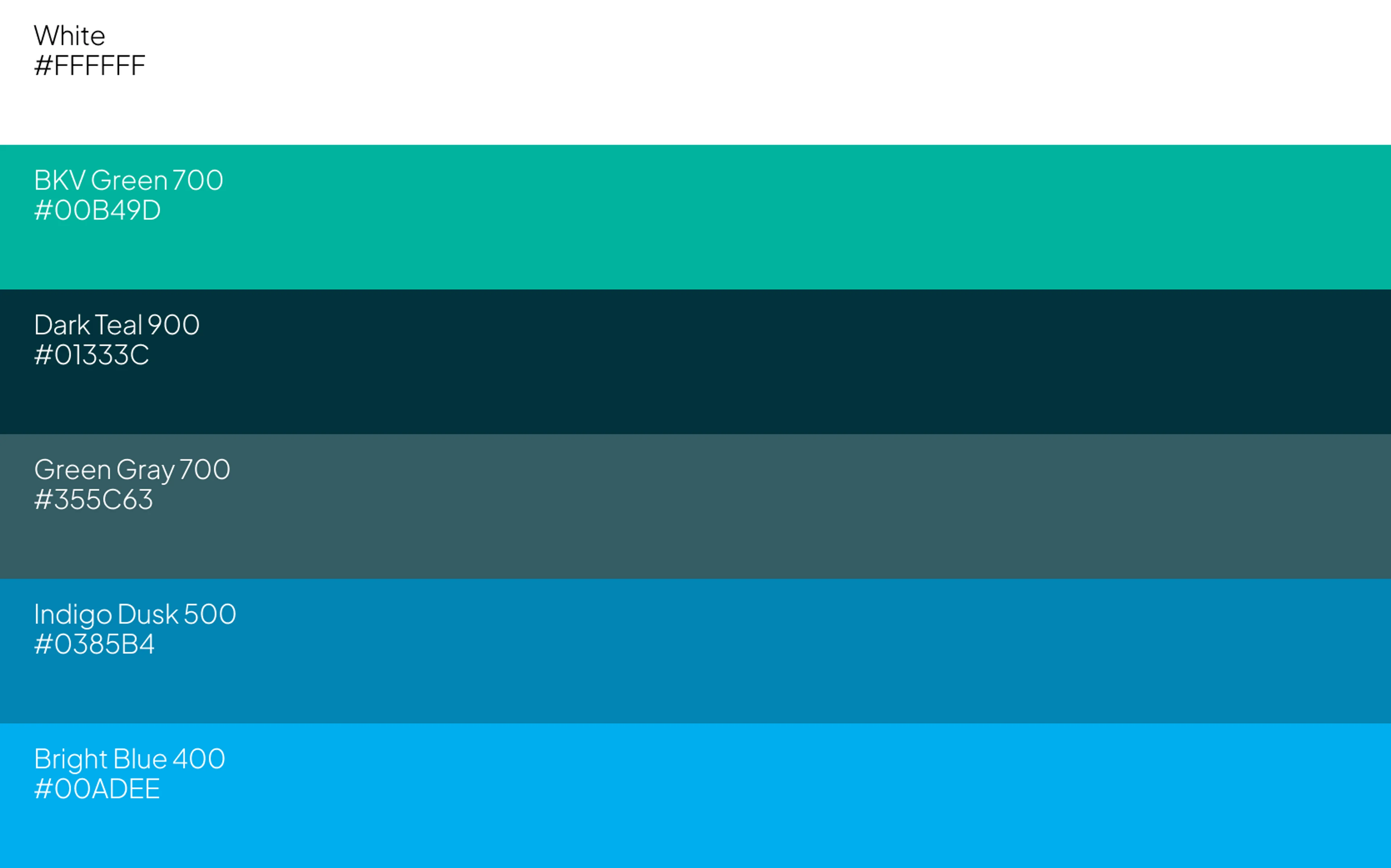
As a reminder, our BKV Blue is reserved exclusively for the logo and is not used as an accent or primary color elsewhere in our system.
Secondary Colors
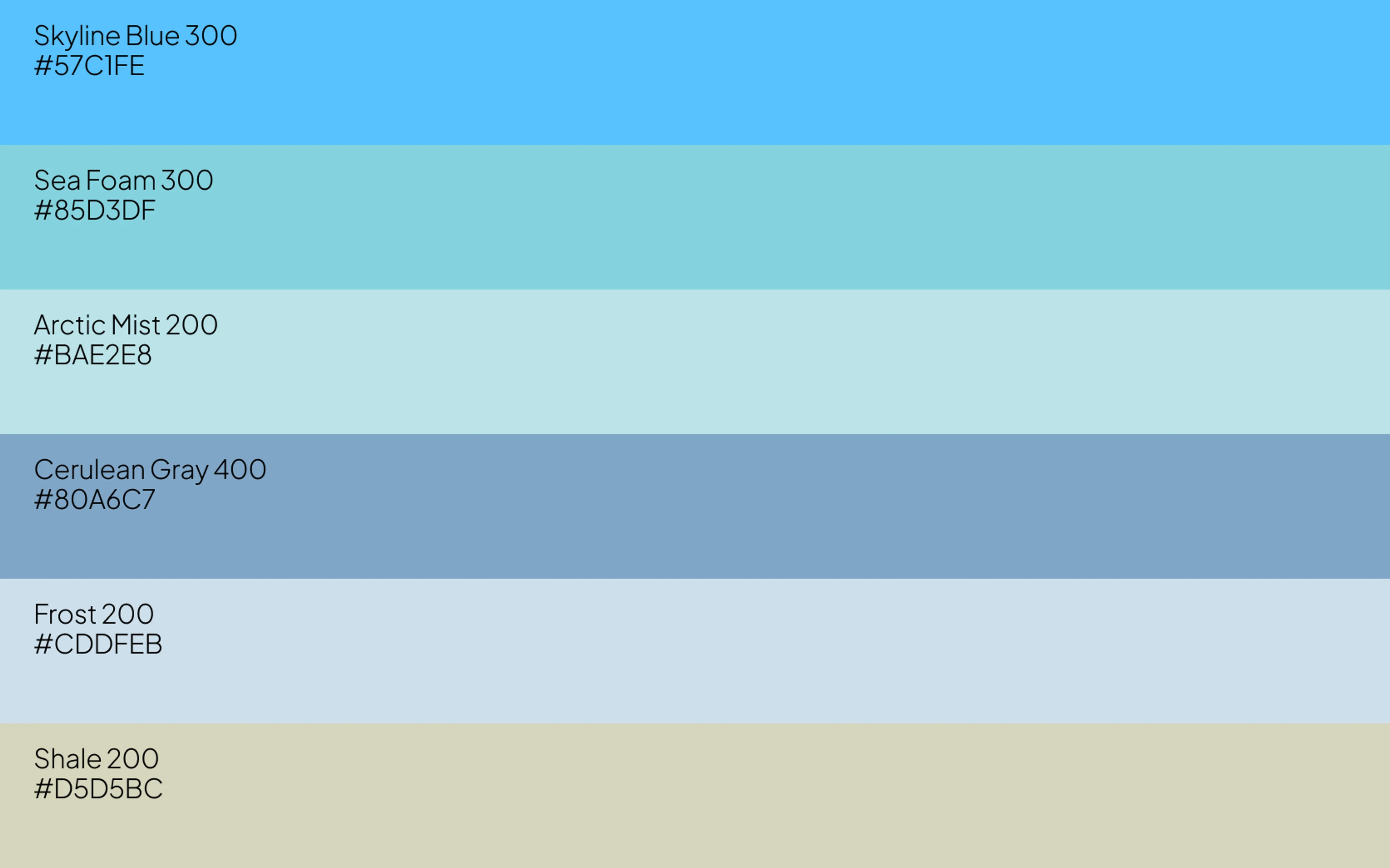
Our secondary colors add variety and depth to our brand communications. They should be used to complement our primary colors, adding a sense of energy and dimension to layouts, illustrations and accent elements.
Our gradient elements are also derived from this color palette.
Tertiary Brand Colors
Our tertiary colors are used proportionally less than our primary and secondary palettes. They add variety and visual interest without overwhelming the overall design.
These colors are best used sparingly for small details, data visualization and accent elements.
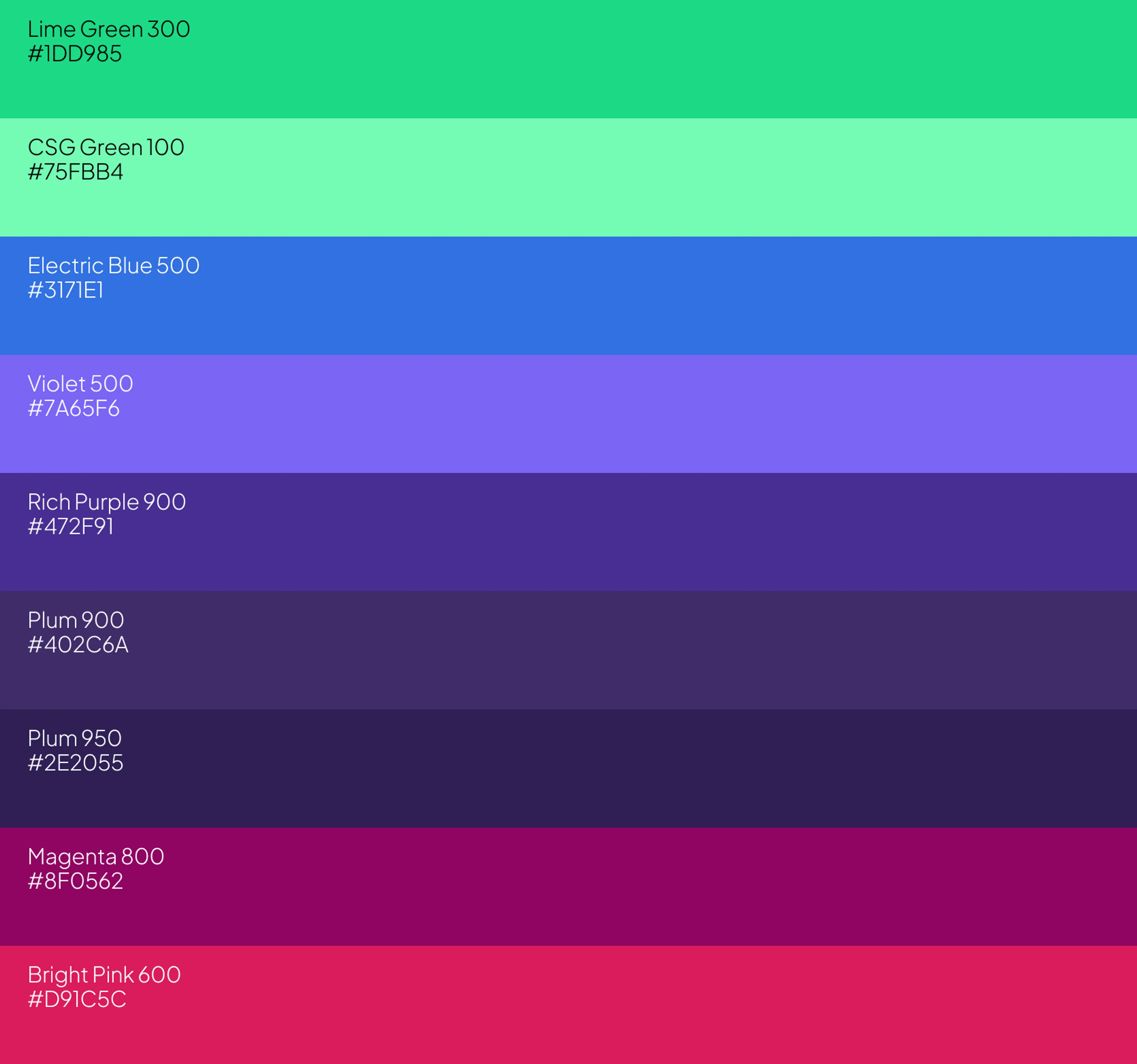
Accent Brand Colors
Our accent colors are either bright or deep, designed to add a spark of contrast and vibrancy to our brand communications. Use them sparingly to add visual interest and depth to illustrations, UI elements and data visualizations without diluting the primary brand focus.
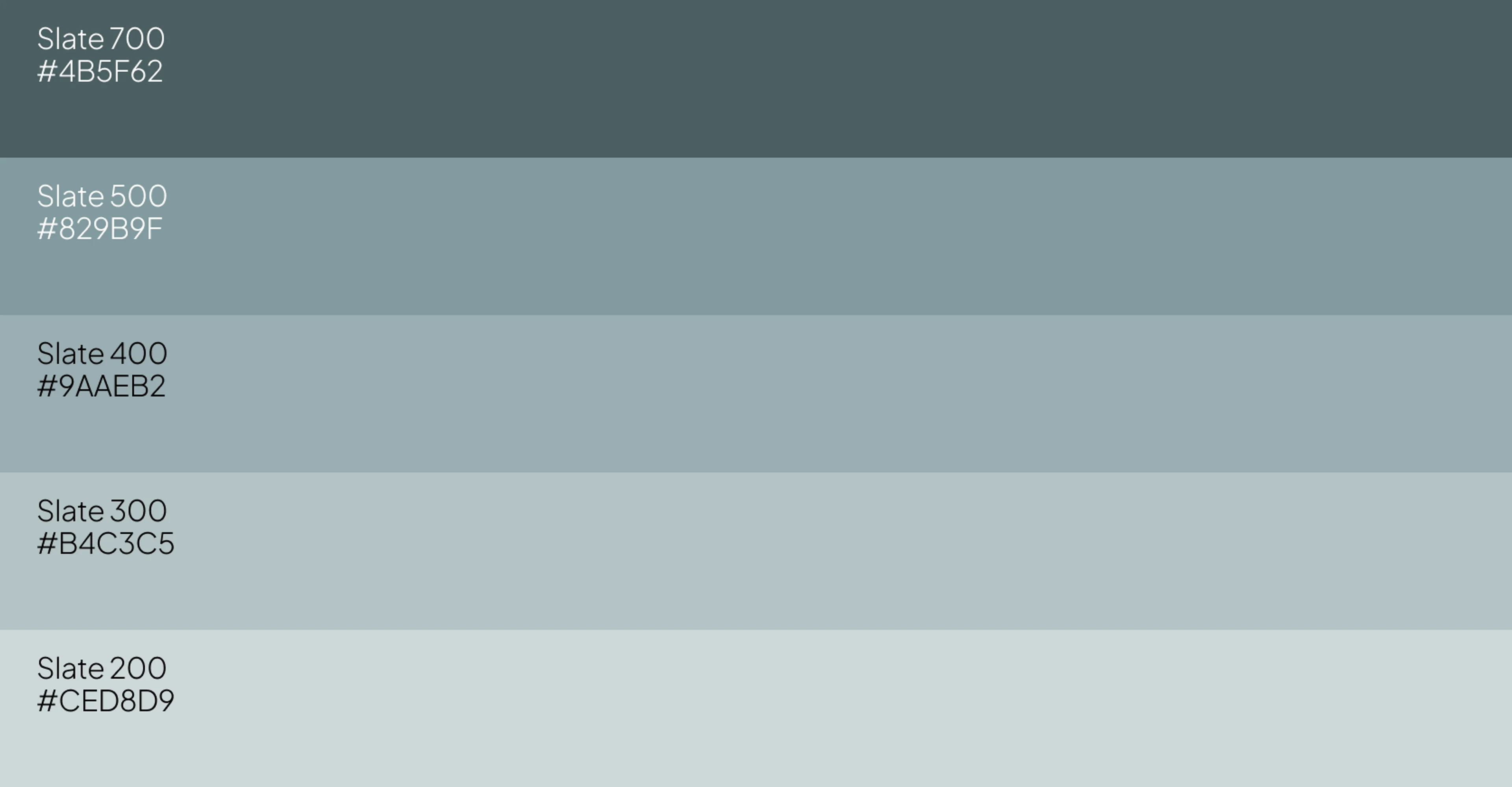
Neutral Brand Colors
Our neutral colors ground our palette, providing a stable foundation for our primary and secondary colors to shine. These shades of slate can be used across a variety of touchpoints, from typography to backgrounds, to ensure a cohesive and professional look.
Accessibility
Our renewed brand is built for clarity and scale, which means all our communications should be as inclusive as possible. To ensure our messages are accessible to everyone, always be mindful of creating high-contrast and legible color and type combinations.
Typography is more than just letters; it's the unspoken tone and rhythm of our brand.
Our typefaces are chosen to be a bold tool and beautiful communicator, working to create a clear information hierarchy and convey our brand values.
Core Brand Typefaces
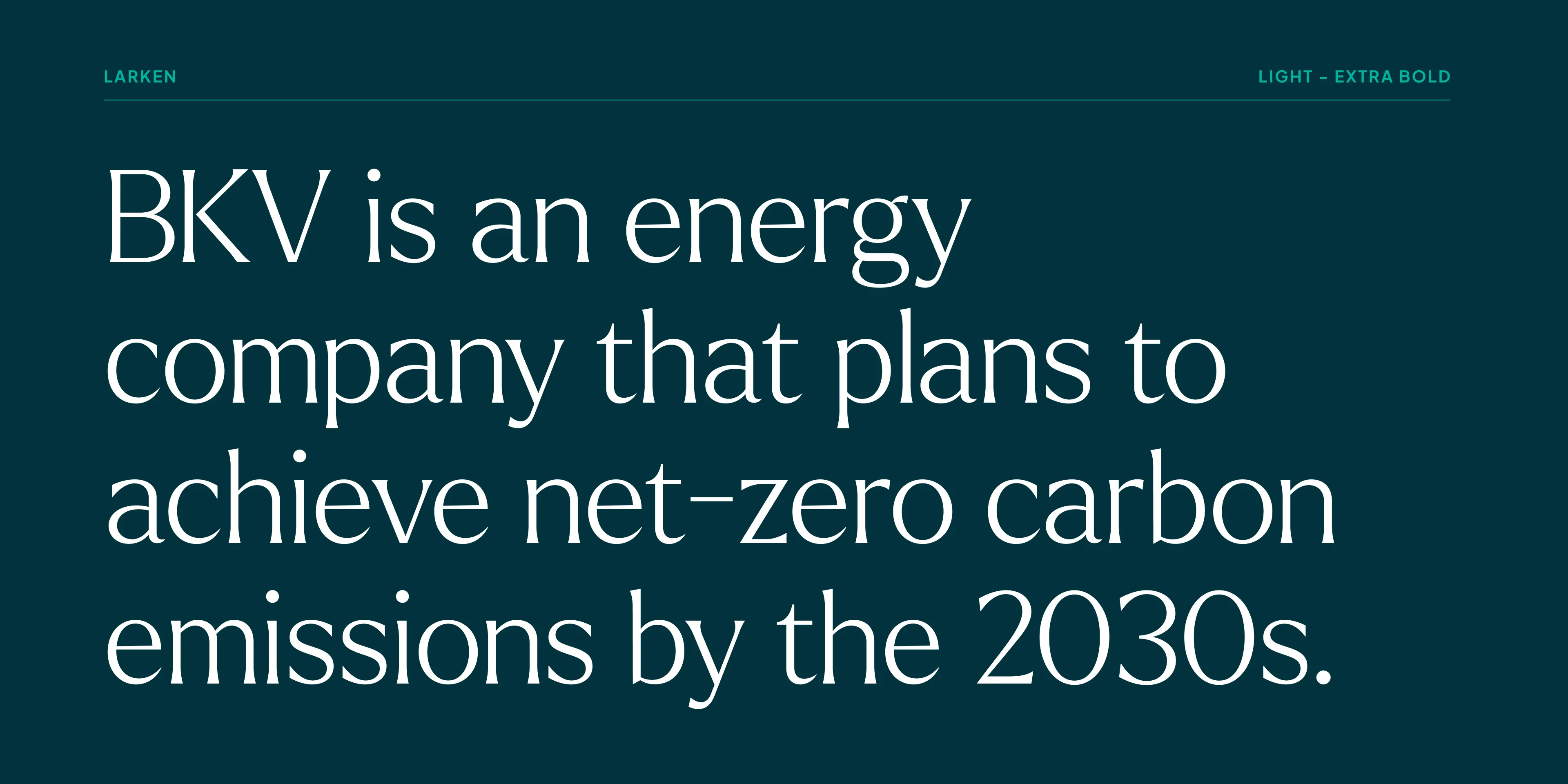
Larken
Our main brand typeface. Designed to reflect nature, it creates a sense of natural softness and expressiveness. Its tone is confident yet soft, and it balances personality with polish to build trust.
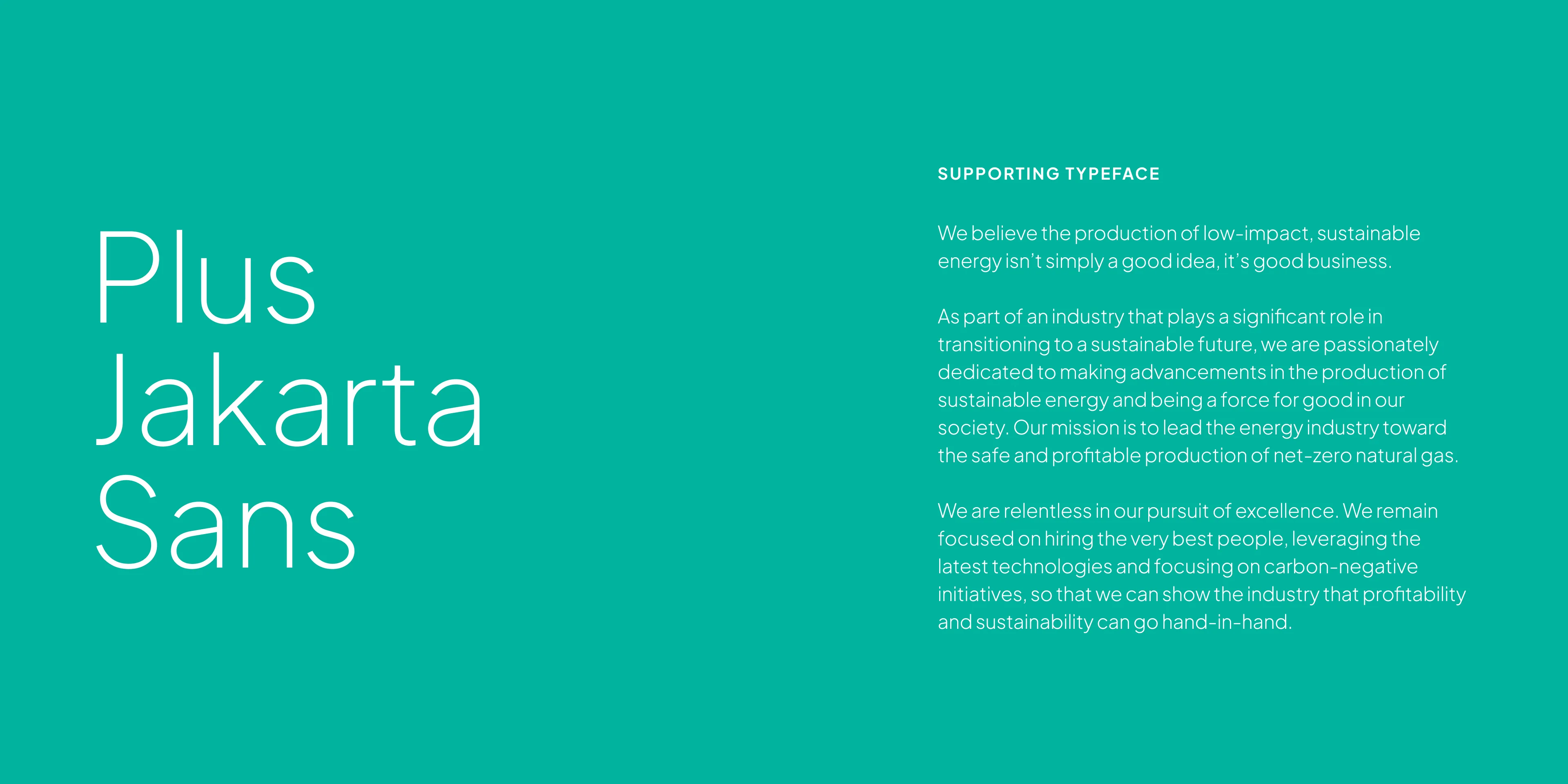
Plus Jakarta Sans
Our new supporting typeface, replacing Futura. This typeface has a screen-first design, making it clear and legible at any size. With a more human and effortless tone, it adds warmth and distinction to our communications.
Microsoft Office Fonts
Since our core brand typefaces may not be available on all devices, we have a set of system fonts for everyday communication.
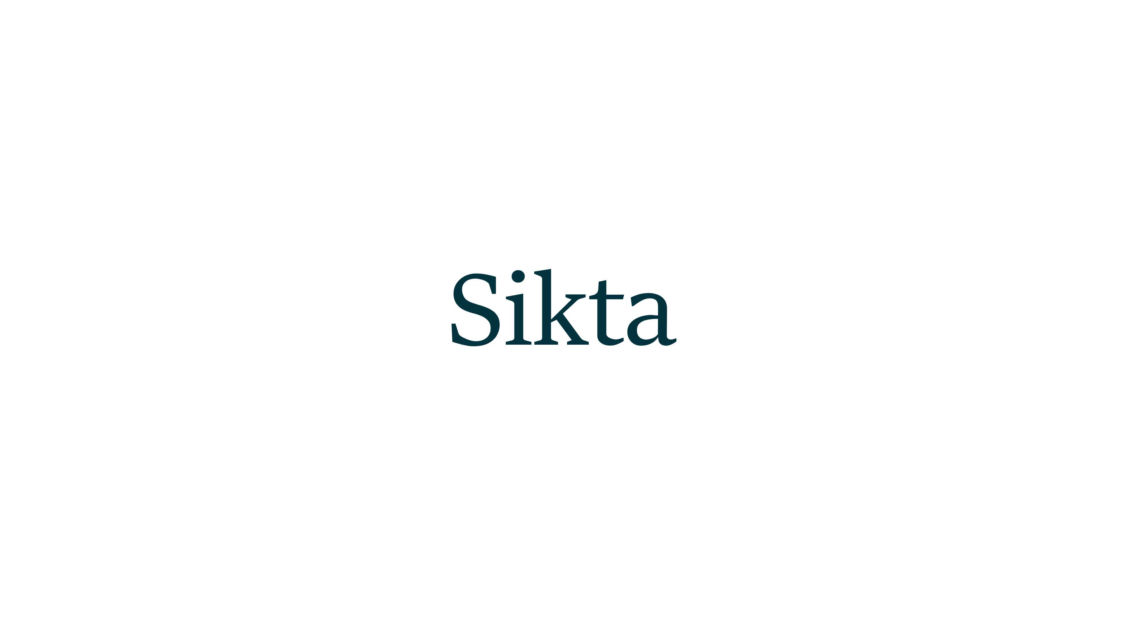
Sitka is our substitute for Larken in Microsoft applications.

Aptos is our substitute for Plus Jakarta Sans in Microsoft applications.
Hierarchy
A clear hierarchy is integral to clear communication.
By using a disciplined and dynamic approach to type, we can create a visual structure that guides the reader and highlights key information. We use scale and contrast to control the emphasis of a message, allowing us to say things with a confident structure.
Always ensure intentional size and weight differences between varying levels of hierarchy, using our primary and supporting fonts as a guide for setting type.
Purposeful Brand Elements
Our graphic elements go beyond visual accents; they’re integral to the brand identity. From dotted screens to radiant lines, these elements add depth and energy, bringing the brand to life. Their use should always be thoughtful, enhancing the message while staying true to the brand’s spirit.
Photon Starburst
The refined Photon Starburst serves as a dynamic graphic element, infusing depth and energy while naturally guiding the eye and sustaining attention.

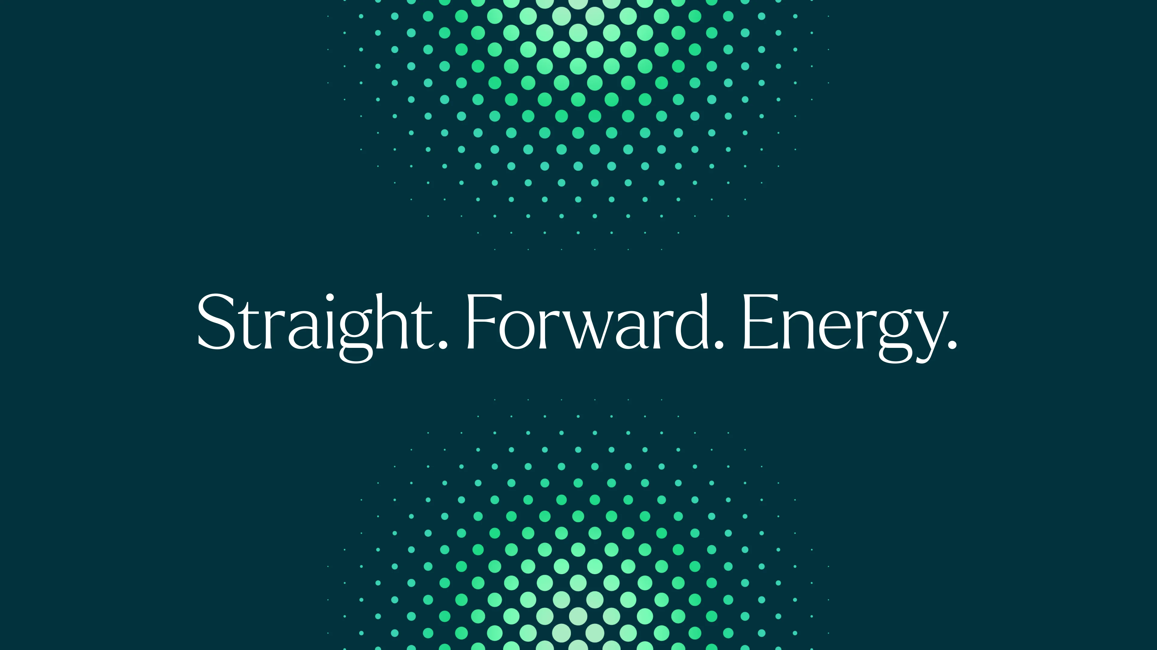

Spark
The Spark extends the BKV logo, radiating energy and focus across brand touchpoints. This visual device is used selectively in investor communications and other financially focused materials. It is not part of our standard customer- or community-facing visual language.

Iconography
This set of refined icons is an expressive, unified and adaptable system that provides a burst of visual energy across all applications. Their circular forms echo the molecular structures at the heart of our design system, reinforcing our commitment to full-cycle innovation.
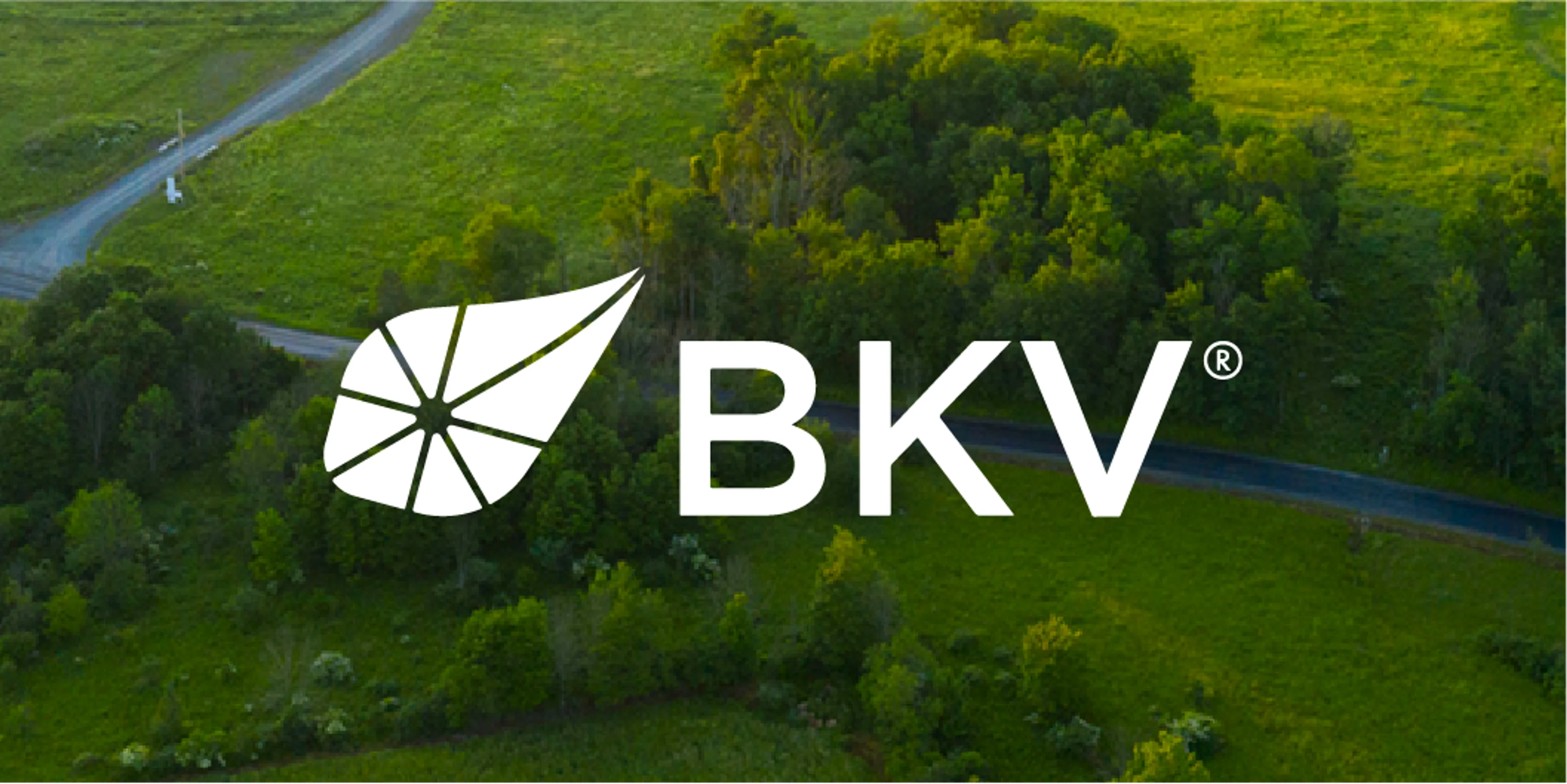
Photography
Our photography focuses on capturing the real energy behind what we do.
It's about telling everyday stories through honest moments, featuring real people in real situations. We focus on people in motion, projects in progress and work being done, rather than posed or staged images.


Our photography captures the people, environments, facilities and technology that keep our industry moving forward.